Short essays and musings from my independent study of Game Design

Category: Volume One Entries

F-Zero: communicating intensity through gameplay.

Watch the video version of this essay here!


Speed is an aspect of a game that requires a lot of careful planning. Too fast and you overwhelm the player, not fast enough, and the game is either boring, or its physics feels too weighty. “Fast games” (like Star Wars Episode 1 Racer, Halo 2, and SSX 3) have everything from good presentation to tight controls communicating an extreme sense of speed.

Despite being from about a decade before the oldest game mentioned above, F-Zero is what I would call a fast game. Everything from the visual and auditory feedback to the controls exudes a sense of speed only present in the best racing games. Since it is an arcade racer dedicated to an air of future-cool, it’s vital that the game’s design and mechanics pull off the speed correctly. Despite being made at the very start of the 16-bit era of console gaming, F-Zero seems to take this challenge on in strides.
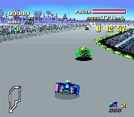
The Blue Falcon in Mute City

Things like jumps, barriers, and other drivers on the track add to the sense of speed and risk. You’re constantly reminded that you could crash and ruin your run at literally every moment. In addition, randomized traffic on the track keeps each run from being a memorized set of button presses for the best time, requiring the player to think on their feet in this intense blur of color and sound.

The game keeps the pressure high by having two distinct loss states to worry about, both are oft in direct contradiction. In my opinion, the easiest way to lose is to “Crash Out”. You have an energy bar to worry about, essentially the vehicle’s health, and once it gets to 0, that’s it; your race is over. You deplete this bar in various ways: bumping into the side barriers, running over marked ground, and running into other vehicles. This system is in place to punish the player for not being careful. Going too fast into a turn or hitting other racers can cause you to get very quickly stuck into a bouncing loop, and it will invariably be your fault. Using the brake on sharp turns and precise movements are not just advantageous in this game; they are required to be able to even finish the race.

The other, and often painfully complimentary loss state is “Rank Out”. The player is given a “safe rank” each lap to stay in until the next lap. Failure to do so or even reaching too far outside this safe ranking will result in an immediate loss and an early end to your run. This punishes the player for being too careful and not taking enough calculated risks. Like precision in control to avoid a fatal crash, taking advantage of risky shortcuts, making turns as tight as possible, and keeping your speed up are all imperative to your success in the F-Zero Grand Prix.

Ranking Out: As explained by the game’s manual.

Kirby Should Be Harder

Watch the video version of this essay here!


Hello welcome to questioning today I’m gonna talk about like Kirby needs a hard mode so first let’s talk about politics in game Anita sarkeesian once said I’m poopy poopy poopy so basically basically easy modes or just away for Marxists to get away with not even giving work and leisure so like that’s why they argue that elden ring should have an easy clearly but this argument isn’t like that’cause they’ll say things like it doesn’t affect your experience like it’s just a simple thing to add it’s lazy game design to not have it but my argument’s going to be completely different so now list gives the meat meat of the thing so I played the Kirby video game came out couple days ago graphics 3 sucky they look like Nintendo 64 graphics because Nintendo sucks the controls were bad my joy cons don’t have drift yet but they’re gonna have drift so controls are bad there’s only one attack but and the hardest mode why wild mode it’s too easy so now I’m gonna explain what Kirby needs to be hard now I know I know what you’re gonna say curvus creepy people playing the Kirby games listen OK curvy is a curvy ISM sucks I don’t even know what that freaking means OK so the game should be harder because when it’s easy it sucks releasing the game harder you know won’t affect the dumb little baby kiddo kids experience because there is there is an easy mode as forgotten land is too hard for them they can go play nightmare in dreamland on the gameboy bands so like you know Nintendo and and and how laboratory and and Shakira Miyamoto camera other Japanese developers should add a harder mode to curmi ’cause it won’t affect you know other peoples gameplay experience yeah they do it you know the island like you know you know I don’t enjoy the game ’cause it’s not hard enough and I know I I know I could have just like not bought it but like like money is the root of all evil and comraderie comes from the Latin camera which meant the device to take a photograph doesn’t have anything to do with saying but I thought it sounded cool since this is a video I say I have to do something but here’s the definition of hard on the screen and um yeah I just I think they should have the hard mode’cause because you know it’s it’s it’s lazy game design if they don’t the developers are lazy if they don’t make the game harder new row how how how would that be lazy the game around a specific philosophy or designing it specifically 2B you know and easy to play but you know you can still cover end challenges you know like how is that lazy well I’ll tell you why it’s because it doesn’t personally appeal to me and I don’t personally enjoy it even though other people are enjoying it and I have to enjoy everything other people are enjoying the other people who and it’s not just that I have different tastes right like different kinds of games it’s just that you know every piece of art should appeal to me personally a Twitter and a guy so I’m just gonna close out with a cookie clear I just wanna say that pink wallop arms and legs yeah Dyson? No, Kirb no Hoover silver Hoover his name is Hoover right OK so Hoover Hoover and the forgotten country should have a harder mode because if it doesn’t it’s it’s bad game design and one sec someone’s texting me discord don’t worry I’m fart perfect OK so anyways thanks thanks for watching like like comment and subscribe smash that like button smash the bel and I’ll see yioy on the flip side!!!!!

Happy April Fools Y’all

The Innovation Problem, or, Why New ain’t always Good.

See the video version of this entry here.


When I was younger, maybe about 9 or 10 years ago it seemed the gaming industry was obsessed with being “innovative” and “unique”.
In fact, looking back its has been this was since the very start of gaming. The mess of controller design that was the Atari and Intellivision era makes that perfectly clear. Later, you had attempts at bringing the headache inducing stereoscopic 3D to your home’s television set and later with things like an 8 processor console with the Sega Saturn, VR that also cause headaches: The Virtual Boy. Finally rounding off the late 90s and early 2000s with the NGage a cell phone that barely runs tomb raider.
Today we have in recent memory “innovative” products like the Ouya, Steam Controller, and most recently Google Stadia.

Many and even all these examples are extremely forward thinking or at the very least, uh unique. An excess of controller face buttons in the past is mirrored in a way with gaming mice that have macro keys on its side, VR has finally made its push into the realm of not just feasibility, but popularity as well, and as for video game streaming, well, Stadia would do well if we wait another 5 to 10 years or so for launch.

While I am simply talking about the wider scope of gaming products and services in general this phenomenon is easy to see in game design as well.
Remember the Kinect, or motion controlled Zelda games?
Remember Heavy Rain?
Remember Star Fox Zero?
All very uh, unique for sure, innovative, well, innovation requires the idea to be adopted by the greater whole of the industry, and uh last time I checked, nobody was wanting to copy the dual screen action of the 7th or 8th best Starfox game… depending on who you ask.

Also, no one is trying to make a uh, movie? Like Quantum Dream.
Along with the majority of FMV games, these are just not remembered very fondly.

Often this is due to poor execution, which I have discussed here before, or simply bad timing.

I actually even liked Starfox Zero but even I recognize that the game is a lazy rehash of the first game, again and would be so much better if they didn’t bet the family farm on this “innovative” and “fresh” new system.

I think the biggest culprit in this “innovation” conundrum us seeing a particular idea in a light that makes it seem to its author as something that will change the whole game and they simply just try to push that one experimental idea. Without a solid foundation to build it upon.
Sometimes making something unique and “fresh” isn’t always the best idea especially if it hijacks all other aspects of a game’s development and design cause sometimes it just comes out real flat and then you end up with something like Boyhood… (did you know that took 12 years to make?!)

Kirbyism, My Favorite Design Philosophy

Watch the video version of this essay here


If you asked me who my favorite Game Designer of all time was. I’d quickly tell you it was certainly Masahiro Sakurai. Since he is the mind behind my favorite childhood games, Kirby’s Dream Land and Kirby’s Adventure and the series that got me into game design and development, Super Smash Brothers.
Sakurai developed both as a rising star at Nintendo, creating Kirby’s Dream Land at just 19 years of age. His primary teacher being the Neo Geo he kept at home for “Study”. Whether by sheer genius or through inspiration wrought on  by arcade classics such as King of Fighters, Sakurai began to swear by his own Game Design Philosophy, that being Kirbyism. Kirbyism is the idea that a good game ought to be able to be enjoyed by both complete beginners and hardened veterans. This is achieved by designing the game in such a way that it is approachable and fun but still challenging . Simple enough for even a child to pick up,  and challenging enough for a experienced player to master.

This is what inspired Kirby’s core design as a series. The ability to float above whole sections in Kirby’s Dream Land seems cheap until you realize that it allows the player to control their difficulty on the fly as they could just as easily choose to play via normal platforming, thus any player should find themselves at least enjoying this Gameboy classic. But more far reaching was the  game Super Smash Brothers.

Inspired by games like final fight, Sakurai wanted to bring the excitement, strategy, and challenge of fighting games not only home, but also make it accessible to even the most inexperienced of players. Either by way of simplification of controls, or by changing what made a KO a KO, Kirbyism was forcefully combined with the fighting game genre to create one of the most popular party games, while also being one of the most popular competitive fighting games of all time.

These aren’t even all the examples of Kirbyism, arguably Splatoon, the kart racer genre, portal, the sonic series, the Pokémon trading card game,  Minecraft, Action RPGs, Halo, modern adventure games, Civilization 4 5 6… and so on have all employed some aspect or all aspects of this simple and widespread design philosophy, which thus made a lot of the games enjoyable by everyone.

Why do I love Kirbyism?

I love Kirbyism because I think everyone should be able to enjoy the games they play, I hope this medium can help make anyone’s day a little better and their smile a little brighter. I want games to be about the Fun and the Challenge, and I think that’s what Kirbyism is all about.

Good Ideas, Bad Execution

(Watch the video version of this article here)


One thing I really enjoy when I have a bit of spare time is watching Baking Competition Shows.

A lot of time, many of the extremely talented bakers will have these amazing and stunning ideas, but then either due to lack of skill or lack of time these end up looking the most disastrous.

Similarly, Star Wars has a history of films based on rather interesting ideas, and good ideas but end up executed rather poorly leading to a lot of disappointment felt by members of the audience. Often this happens with Video Games as well, Superman 64, Fallout 76, Starfox Zero, I could go on…

Baking show fails, Star Wars, and all of these games have something in common.
They have great ideas that are matched with disastrous execution. A lot of the time we tend to be the most disappointed by the things that have the highest potential at the core of their ideas. This kind of disappointment tends to evoke hatred and vitriol or at least, like 36 hours of awful videos from The Quartering.

To put it simply, people especially hate things that leave something to be desired.
(while I understand this is a game design blog, its still my blog so I’m gonna do what I want)
The Star Wars Prequels were probably the most hated movies of the 2000s, and for good reason, stilted writing, weird characterization, lack of consistent villains, zzzzzzzzzzzzzzZZZZZZZZZZZZZzzzzzzzzzz
but at the trilogy’s core were some great concepts, an exploration of the political intrigue of the Star Wars Galaxy, expansion of the Jedi and Sith lore, and a space fantasy Citizen Kane-esque tragedy about the franchise’s most iconic villain, Darth Vader.
Much more loved than these films were and are the extra content that used those same ideas, KOTOR, Clone Wars, Battlefront, and they happened to execute them so well that many feel they redeem the prequels by association.
So why don’t we do the same?
Next time we find we hate something, for the purposes of this video, a game. After we are done laughing at how bad it is may we should find what ideas created this sensation of disappointment for so many, and try to execute it well, because I don’t think any good idea really deserves to be left unfulfilled.

Do you?

Try, Try Again Souls

(Watch the video version of this article here)


Dark Souls is So well known for being difficult that any remotely difficult game ended up being called “The Dark Souls of (blank)” by reductive journalists for years after its release.

oh, honey…

But more important was the Action-RPG formula From Software pioneered and perfected through Demon’s Souls and Dark Souls that their legacy lives on in a whole sub-genre of game:

The Souls-Like

Souls like games consist of several design choices and mechanics that honestly garner their own entries into the diary one day. But today I want to touch on my favorite

via GIPHY

For the purposes of this essay I am going to call this the “Try Again Mechanic.” A Mechanic that effortlessly and by design encourages and nearly forces the player to get better at the game, and to find it at its roots were going to have to look way back to some of the earliest and most influential games.
To go back to one of my favorites to talk about and the subject of entry one, Super Mario Brothers. In this Nintendo classic there was no saves, no checkpoints, if you got game over, that was it and you had to start all over again. This was mostly due to the technical limitations of the time, but these types of games, or to be more specific these games that lasted with players forced the player to try and try again. As Saves and Checkpoints became more prevalent this mechanic of having to try again from the start started to fade into obscurity, as a result games became longer, more complex, more difficult, but all the less punishing.
by the 2000s a popular trope in games had become the respawn mechanic, which made for unlimited lives which made games far less punishing. This mechanic and well saving in general requires quite a bit of additional suspension of disbelief.

or does it?

When from software set out to make the PS Triple Ballin’ classic Demon’s Souls I’m sure they really wanted to explain player characters continuing to live even after being eviscerated, and eventually they perfected this lore explanation in Dark Souls.  In Dark Souls it is explained that the player is a “Hollow” Someone who is basically immortal and can regenerate themselves near a bonfire, or the save point of the game, and can even restore their Humanity using a consumable found in the game. Along with this, the experience system is as follows, each enemy you kill and boss you defeat you gain “souls” that can be spent at the lift giving bonfires for better stats.
When you end up dying you lose all said souls and have the opportunity to gather them back up if you run over there from the bonfire. But there’s just one catch.  use of the bonfire, and that includes respawning, regenerates all standard enemies on the games map, you have to play better than you did when you died or you’ll die on the way and those souls you lost the first time will be gone for good. With this system, the player is directly encouraged to try again, learn the mechanics, try new strategies and come out victorious… eventually, as it is still common for these games to be infamously difficult.
Many say they cant enjoy a souls like and others say they’re hard to enjoy for this reason, but I argue many miss the point. Much like a difficult hike or Baum’s classic The Wizard of Oz the joy is in the journey and what we gain along the way.  In a Souls Like the best solution to any roadblock in the game is simply getting better at the game, thus the ubiquitous meme “git gud” really started to become a definitive part of the game’s community. Because of this victories feel the most earned ; the player worked hard to develop their parry timing and stamina management after each death. They tried again and tried again until they could say that they came, they saw and that they conquered.

Open Ended Design Courtesy of 1974

(Watch the video version of this article here)


Chang: I am Brutalitops! the Magician! Ha, ha, ha. Magic user, baby. What?

Abed: An arrow flies through the air, almost hitting Brutalitops. Six goblins are running toward you, drawing daggers.

Troy: Oh. I attack them using my… additional notes.

Abed: It has no effect.

Community Season 2 Episode 14 “Advanced Dungeons and Dragons”

That was a moment from Season Two of Community and may hit close to home for any one who has ever experienced the hobby of Dungeons and Dragons before, or most Table-Top RPGs for that matter. There’s a lot of things that could be said about Dungeons and Dragons and its influence on Video Games and their mechanics decades later. However, I want to talk about one interesting design aspect that is highlighted by Mike from Red Letter Media during their commentary of that one really bad Dungeons and Dragons Movie.

…it’s (D&D) made so that there’s so many different ways you can tell stories. There’s no like, its not like Star Wars, you know? Blow up the Death Star or whatever, there’s like, a very specific kind of story. The Dungeon Master has to uh think on his feet, and change the storyline as it happens. You could totally f–k with a dungeon master’s plan of where they’re going, “I’m not gonna go this way, I’m gonna go do this s–t instead” and so hes gotta scramble and rewrite the story as its happening. It’s kinda fun actually.

Mike Stoklasa of Red Letter Media


He goes on to elaborate by explaining that he “ruined” a campaign by killing the final boss by landing a critical hit with a single dart. This is a hilarious example of what D+D at its core is,

collaborative storytelling.

Dungeons and Dragons is much more a system than a game itself, as while pre-made campaigns are a popular and a great way to play, from my experience home-brew campaigns are much more prevalent and rewarding to play, anything could happen in a campaign, sex atop the corpse of a hydra, using magic missile in a bar fight, and much much more.

There are important rules that must be followed however. This is to keep the game consistent and not feel like a playground pretend session, while keeping it open enough for storytellers and players alike to be compelled by the experience.


The addition of chance and skill checks adds the possibility of failure just enough so the table can’t plot armor themselves into immortality.
The game, when played right is brutal, tense, unforgiving, and still more beautifully open ended than most games today.


Not only may I use D&D as an inspiration but its design allows for it to be used as a valuable tool for storytelling and quest design.
When you’re a DM you still have to guide the players through an interesting quest or adventure. Its why Skyrim or Grand Theft Auto works while many procedurally generated open world games don’t, or at least as well. It takes a lot of skill and talent to make a compelling campaign for your party to stumble their way through and it still has to be planned.  On the same side of this coin, I have heard stories before where a DM designs this perfect story and thinks that the party will make the same decisions they want them to, but when they don’t, they either have a meltdown or it just breaks the game. (Many Video Games are designed this way and are typically derided for taking away player choice.)

It requires thinking on your feet, I learned this the hard way while in Korea both teaching English and teaching about my religion, You have to think on your feet. The students or party members are not always going to be fascinated by the lesson or quest you have that day and you must adapt. A good DM will take something a player does that goes completely against the story and turn it into a new angle or a new questline.  I believe this is a large part of the reason why with all the tech we have in our video games, tabletop gaming and particularly table-top RPGS are still extremely popular, in a good D&D campaign there are no boundaries, or invisible walls, you can ride the bike in the Pokemart, go see whats beyond that wall, and kill the NPC you’re escorting. What becomes of it, the story you’ve participated in, can be something worthy of remembering fondly.

Communicative Level Design in Super Mario Brothers

(Watch the video version of this article here)


Super Mario Brothers is a pretty pervasive game, it was the title that launched the NES and Famicom into the stratosphere of public opinion and sales and may be one of the few pieces of software to save the video game market after the games market crash in the early 1980s. Everyone knows Mario, everyone has memories of Mario and it started here. ( well it actually started with Donkey Kong but whatever. )
Super Mario Brothers  taught millions of Children the language of Video Games through this simple first level. Nowadays you’ve got games that have tutorial levels and reminder dialogue and and holding to teach the complexities of the Game, which is fine… I guess.

“Omochao” from Sonic Adventure 2, the Robotic tutorializing nuisance of the Sonic franchise.


But, way back in 1985 games didn’t have dialogue or a streamlined tutorial level. Most playthroughs of games started and ended with the console’s power button. Super Mario Brothers was no different in this regard. So the initial level had to be something players could learn quickly how to play the game from while also being a level returning players wouldn’t fell bored and patronized by.
So here we have world 1-1, iconic music, iconic scenery and iconic design.The controls in Super Mario Brothers are probably the simplest of any NES title, you have left, right, down to crouch but no use for up. the only vertical  movement in the game is achieved by pressing A for a jump, and it is A because you will be jumping most often in this game. These are all the basic things you figure out during the first few seconds of the game, just by experimentation alone. That is, without a manual handy. The next piece of this communicative level you encounter is a mystery box, some floating bricks and this little mushroom guy.


Super Mario Brothers' tutorial section.
Observe the order in which everything is presented to the player

The section in question.

“Maybe you’re supposed to walk into,
nope
what does B do? Dash? lets try that
nope
For now I’ll just get out of his way and see him later I guess. “

The first thing about this level and the games design in general is it gives you two options to move forward, avoid enemies, or find a way to eliminate them. Sense the controls are so simple it doesn’t take long to find a way to dispatch these moving obstacles by jumping on them.
The next piece of this brilliant level is the question mark block, the regular bricks are similar to the ground and in context is not much of interest compared to the bright yellow square with a big question mark in it, interestingly enough the Japanese cartridge actually shares this shade of yellow with the blocks. It just has to be something interactive… right?

You cant walk up to it an interact, there is no interact button as earlier we learned what B does.  So again through the simplicity of it all you try everything until you figure that jumping under it would work. The game rewards you with a coin, a nice ringing sound and points to tell you that you’ve done something right. The other question mark blocks in this game’s opening also reward the player with power up silently teaching the player how power-ups work in the platforming title.


Why is this section of this level of this game so important? Because its a perfect example of the game itself speaking to the player without using any words. Allowing the player to learn the core of  how to play the game through experimentation alone.

I hope to be able to emulate this same kind of design driven communication when making my own games, because its a hell of a lot better than Omochao.